LO4- P4
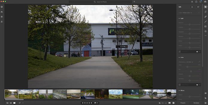
For the Doncaster rovers stadium image I realised it was too dark for it to look nice so I increase whites and blacks making the overall image brighter. I turned the Temperature up in the photo to make it look more yellow to give that summer effect in the image and then turned up vibrance to make the green pop out a bit more, then I turned the saturation down a little to counteract the vibrance so it looked more natural. I used the brush tool and highlighted the grass to make the grass brighter and come out more and if you look closely the grass has little golden patches to fully reflect the summer, using the brush tool also made the yellow flowers stand out more making the photo look better.
This is the statue at lakeside, this was a similar situation with the Doncaster rovers image as the image was really dark but was a good image after it was brightened up. When editing I turned highlights all the way down so you could see the cloud definition more as you can tell from the first image its more blue and you can see the clouds much clearer, turning whites down as well also added a little detail to the clouds. I then increased blacks as the photo was naturally dark this brightened up the photo overall and then put on a lot of vibrance to get the image to stand out and then counteracted the vibrance by lowering the saturation. I used the brush effect again to make the statue come to life with the image as the normal edit make the landscape brighter and better but left the statue staying dark.
The church was an overall good image but it needed minor tweaks to make it stand out more as a photo so I gave the church and trees more colour by increasing the contrast, shadows, whites and blacks doing so made the image stand out more and increase the contrast gave the extra detail to the church and its colours. I did also decrease highlights as well to get the sky matching in with the backdrop, I also upped vibrance and saturation a little bit to make the trees more green. Finally I cropped the image because there was a green building to the right hand-side which made the image look odd and I also cropped out the railing which was at the bottom of the image doing this made the image look more natural and better.
For this train station image I wanted it to look like an olden rail way station as it already had the industrial buildings in the background and the old looking unused train. I decreased exposure, contrast and whites to make the image look a little dull to add to the old effect but doing this made the image really dark so I increased highlights so the white on the trains stood out more I also increase shadows and blacks to increase the overall darkness of the image. But to complete the olden effect I increased vibrance but then decreased saturation by a decent amount causing it to give the old effect I also increased the grain to make it look like it was took on an older phone. I cropped the left side and a bit of the top of the photo as it was unnecessary to have more industrial in the background.
This is a photo of north bride with the train tracks going underneath it, in this image I increased contrast exposure, saturation and vibrance to make the colours stand out more vividly. I also put the temperature up to add the yellow effect to the image. I make the sky grey by putting highlights all the way down this added to the industrial and railway life. I did turn up texture to increase add more detail to the image and also increased clarity and dehaze this made the image look sharper and gave this cool painting effect to the image.
Because this image was so dark to begin with I turned up exposure quite high before I did any editing this was so I could see everything in the image so I knew what each different effect was doing to the image. I increased blacks as majority of the image was black so it made the image look like you were seeing it in person as everything was bright enough to see. I turned down contrast and highlights because there wasn't a lot of colour in the image so increasing the contrast wasn't needed and then I decreased highlights so that you could see the detail on the premier in moon logo such as the smile the moon has. I increased shadows by a tiny bit to add effect round the premier inn sign to make it pop out more compared to the dark, I increased saturation to saturate the premier sign as well making it pop out even more. After doing my edits I turned the exposure down to a point the image looked natural and still kept the little effects I made.
To the hills image I didn't do much as u can tell it was very blue as the camera had a blue filter on so my first thing was changing the temperature I increased it by a good amount to rule out most of the blue, the blue filter did add a good effect to the photo because it kept the sky nice a blue which created a good contrast in the image. I did other minor tweaks such as increase shadows, whites, vibrance, saturation this was to make the image lighter and add more colour, I did also add a tint of green so the landscape of the hills stood out more making the bushes look more nicer.


Comments
Post a Comment